Case Study for Moglix
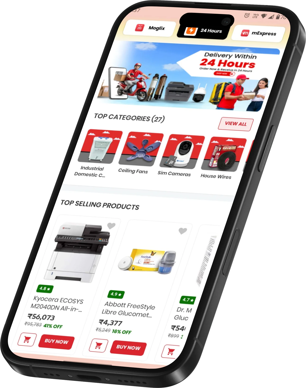
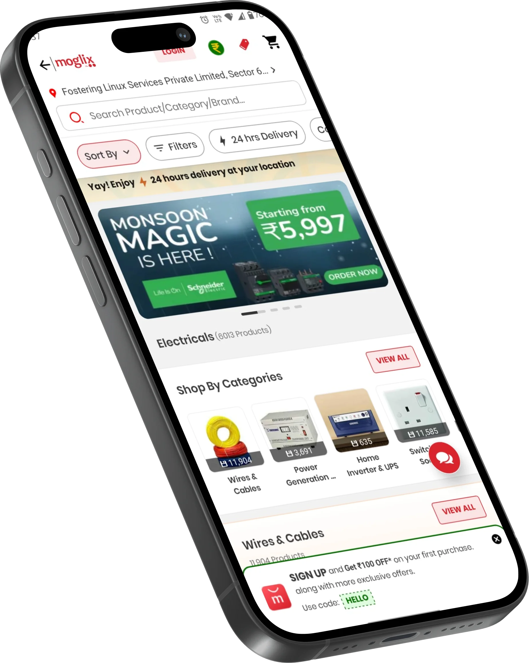
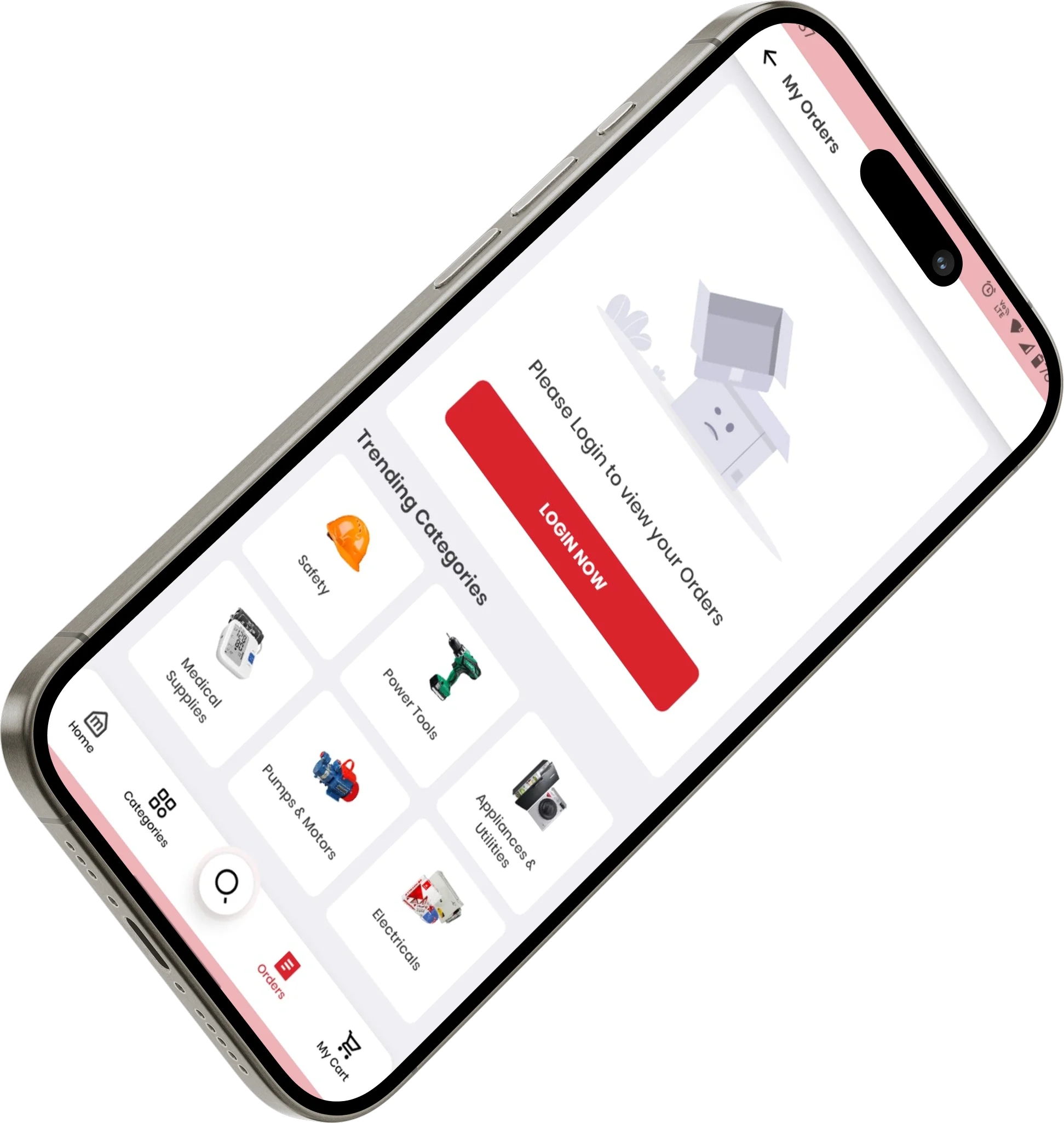
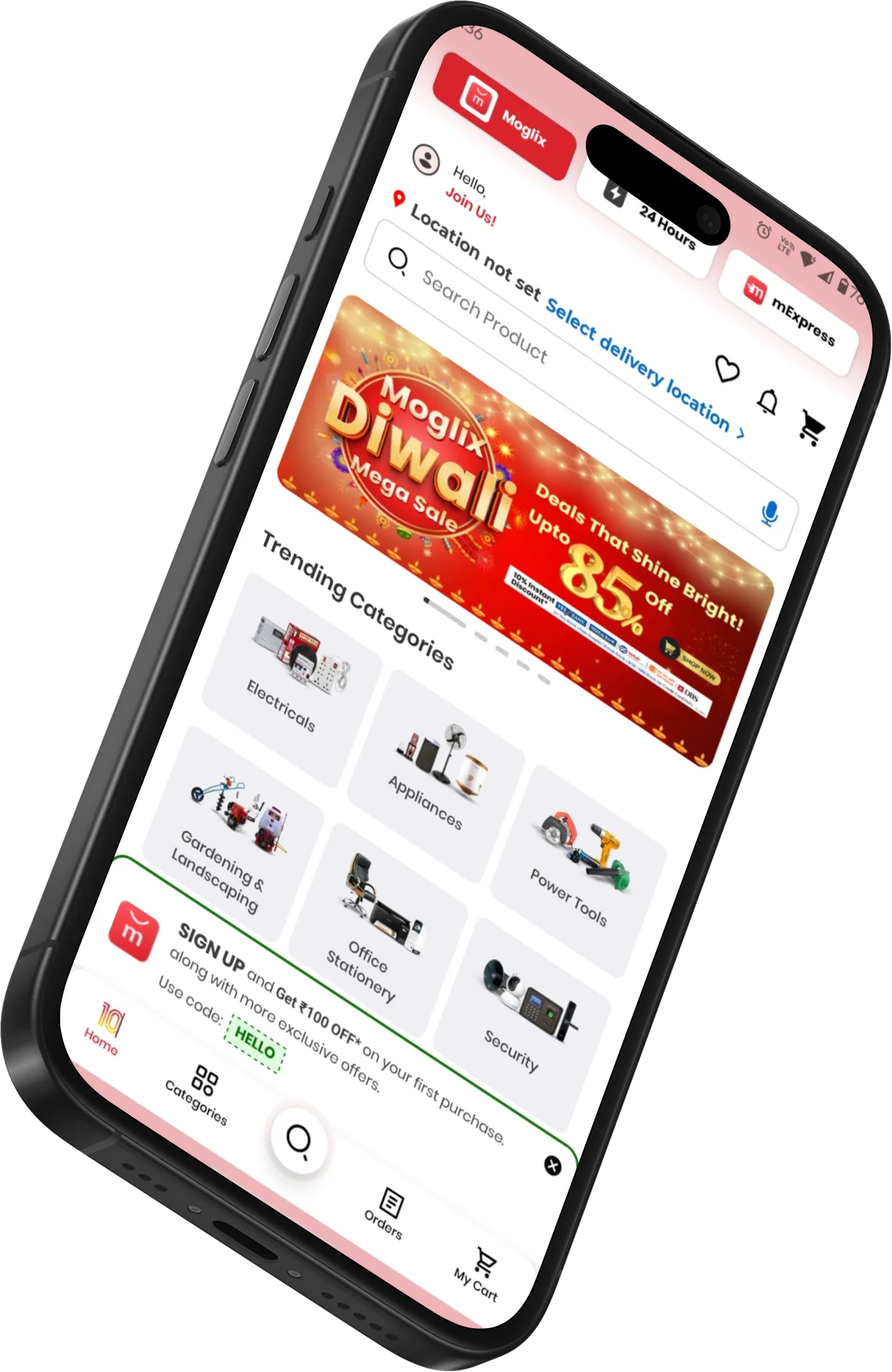
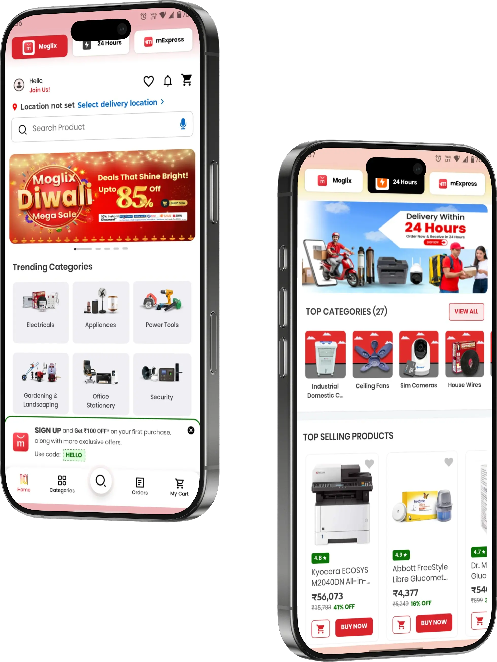
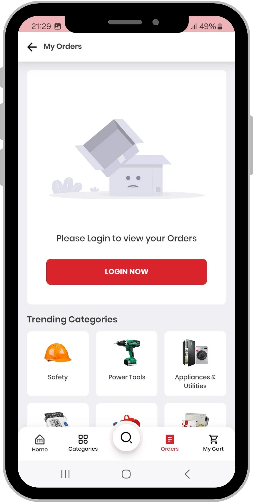
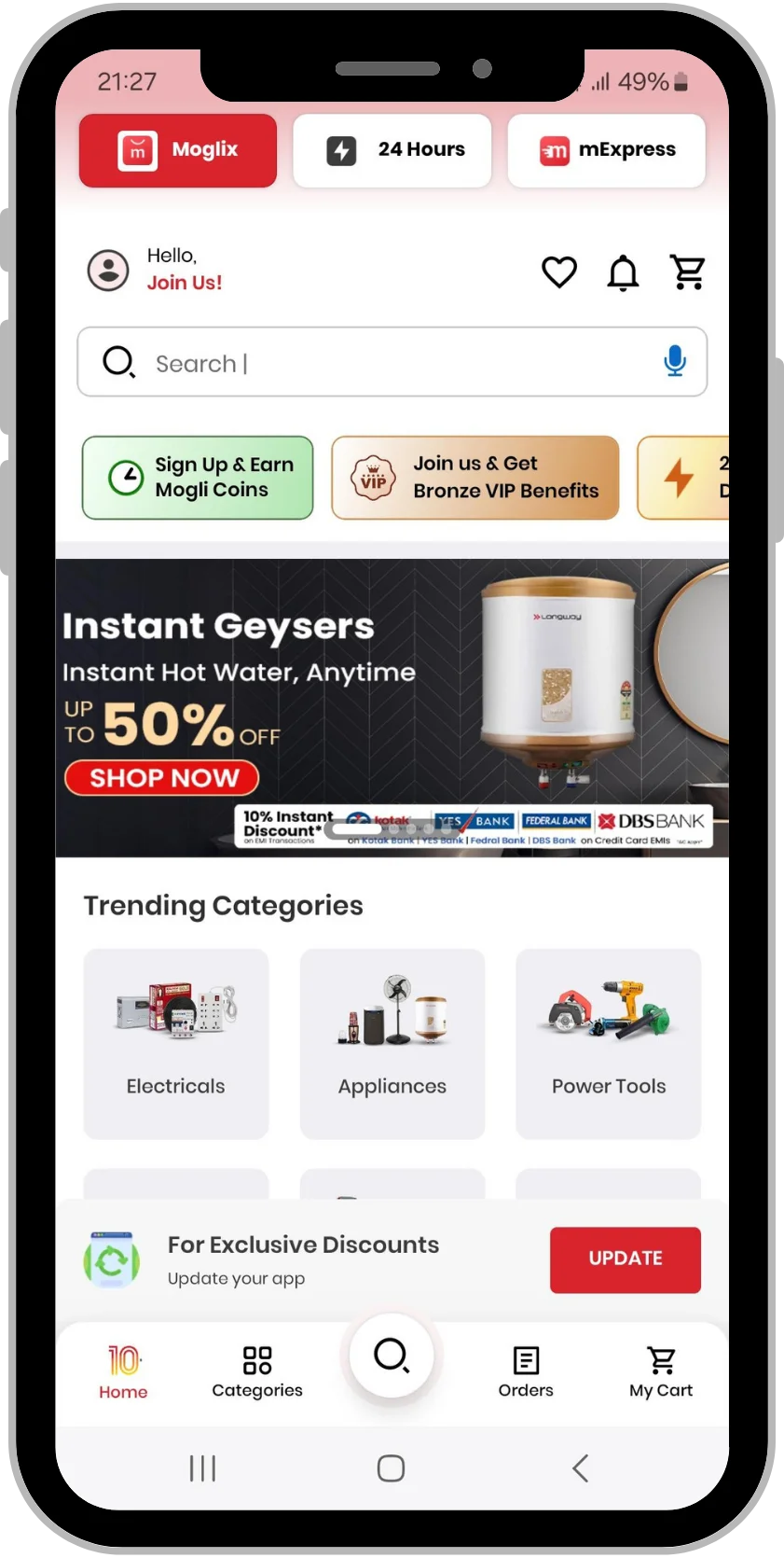
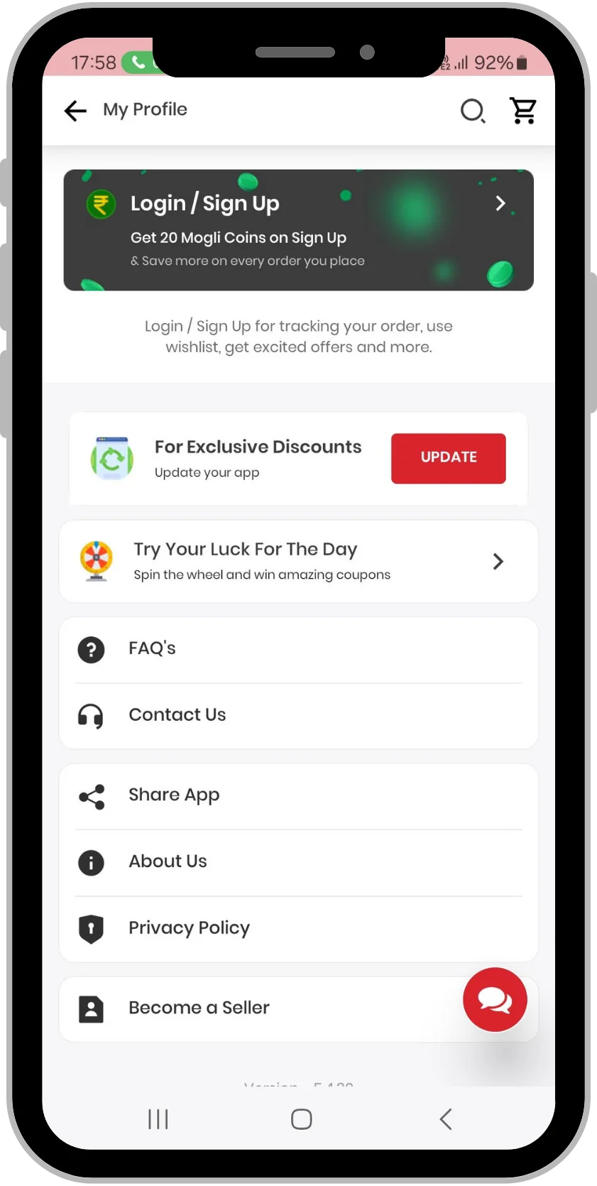
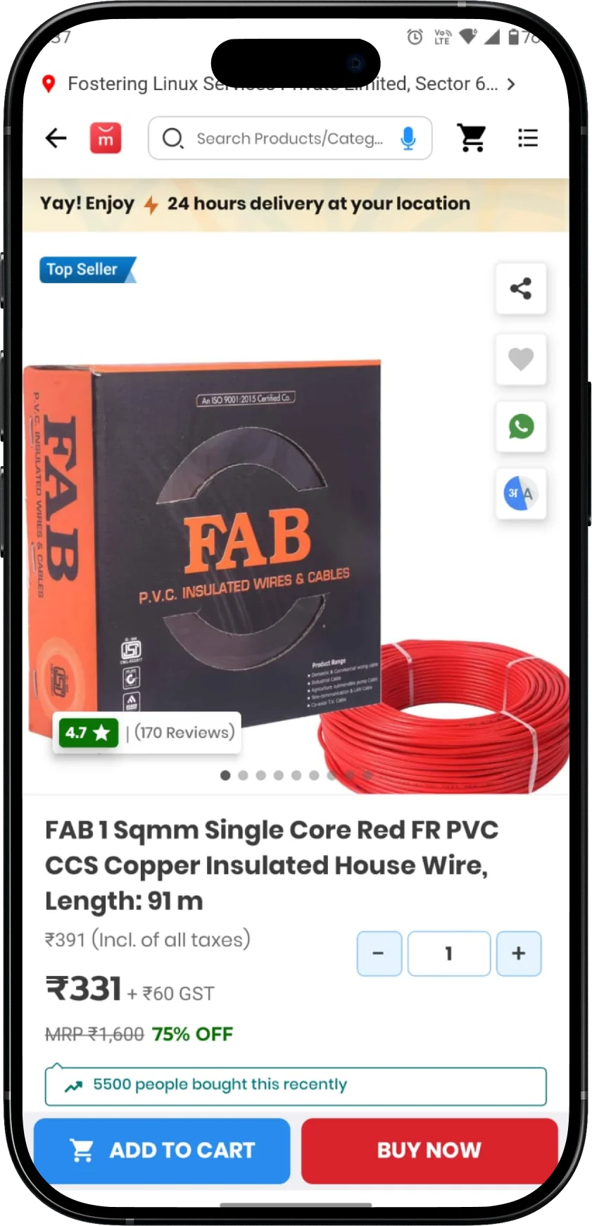
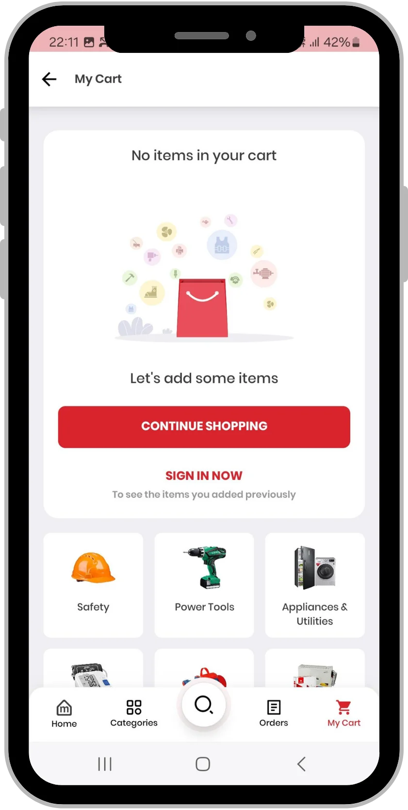
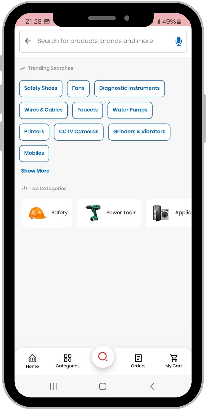
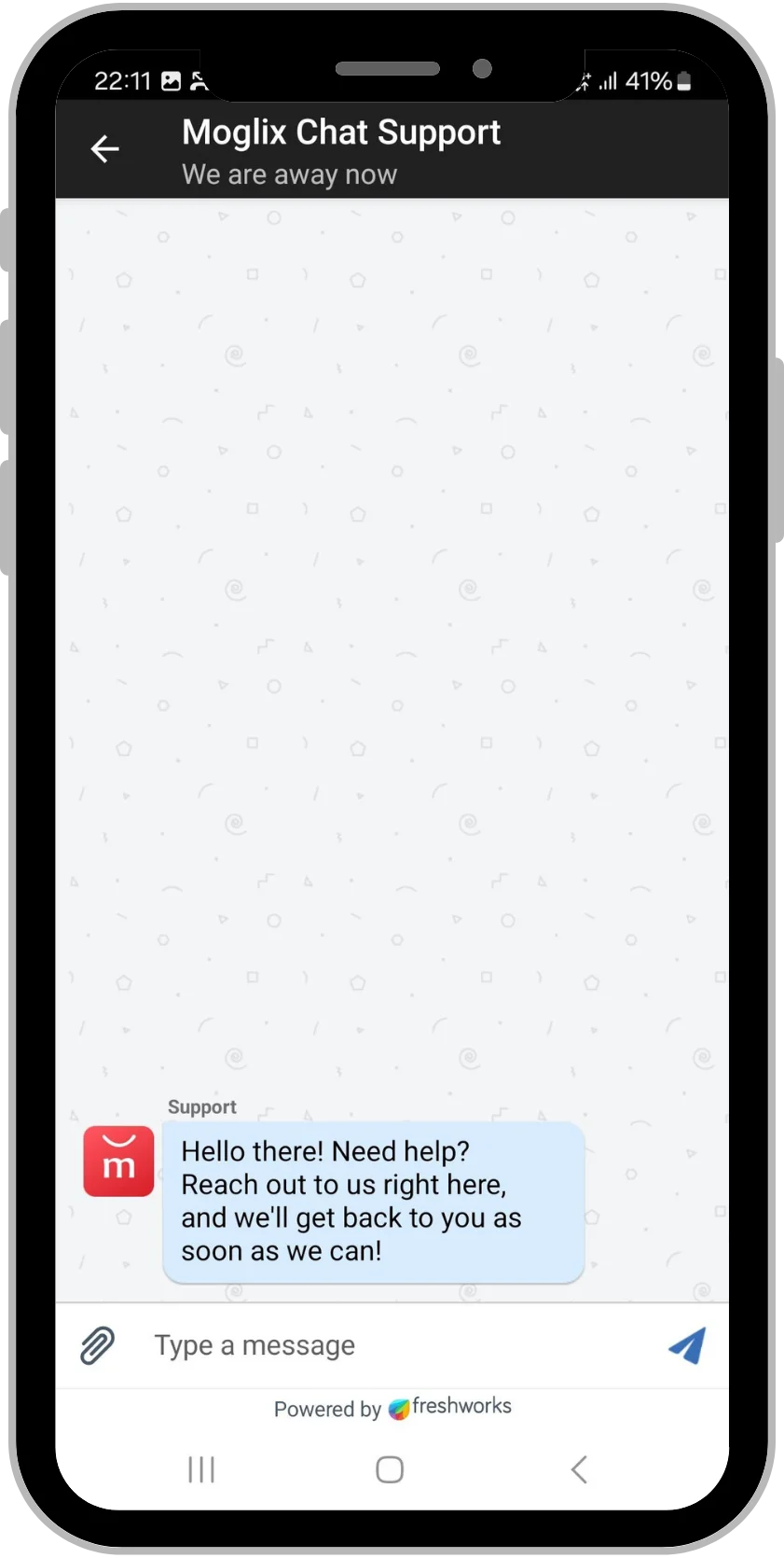
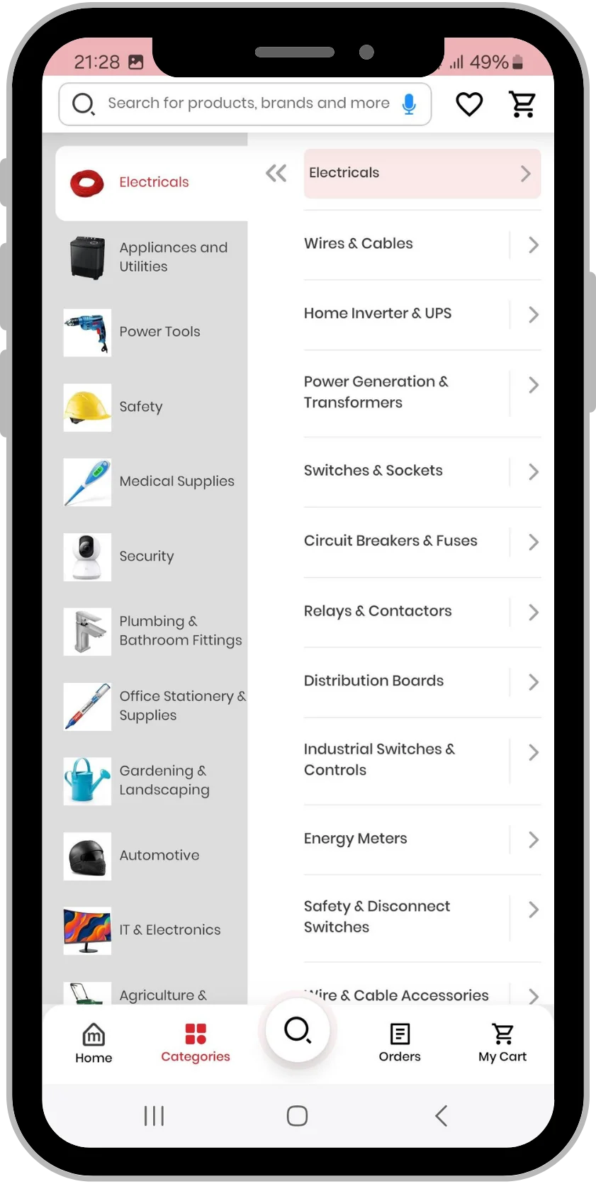
The Moglix app is designed for a seamless shopping experience with easy navigation for a wide variety of products. All products are listed in detail with complete product information available at your fingertips as well as offers offering the best price for the products.
3 Million Download | 4.5/5 Avg. Rating | 17 MB Size |
---|
Technology Use
Android | iOS | Js | Angular |
---|
The Moglix app is designed for a seamless shopping experience with easy navigation for a wide variety of products. All products are listed in detail with complete product information available at your fingertips as well as offers offering the best price for the products.
Moglix regularly offers the best prices and amazing deals on these products. You can buy bulk products directly at wholesale prices from our variety of products.
Research Findings
Our systematic investigation of the users and their requirements to add context into the process of designing the user experience. The app employed a variety of techniques and methodologies to uncover issues, tools, and user experience, which revealed valuable information that was ultimately fed in the process of designing.
Purpose of The Project
This project is about a Ecommerce app that makes it quite simple for the delivery guys to make the service quick and consumers to choose their favorite online shop with the best your product.
Sketching for Visual Design
Our process of sketching was great and the design was inspiring. This project also helped us learn a lot about actual user flows. It was a good opportunity to understand that we must stand in users’ shoes and design a mobile app according to their requirements.
App User Interface Design
Our approach to a mobile UI is more graphical and mainly touch sensitive on a smartphone device. Beit a tablet or smartphone that allows the user to interact with the apps of the device functions and content.
CRAFTING THE EXPERIENCE
Mapping the basic flow of the app made us realise how a user would go through the app inside each flow. We treated this as a sitemap to finally start crafting all the screens of the app.
MONITORING THE PIPELINE ACTIVITY
Our rigorous testing found out that the metrics played a key role in enhancing user experience. Our well designed wireframes make it easy for the users to see what pages their leads are viewing.
Wireframes
Based on the user flow on top, we outlined the app and imagined it visually. The visual guide represented the skeletal framework of the app. The idea created wireframes presented information architecture of the future layout.
Our Approach
Like every product of ours, this product was also developed in multiple stages in order to deliver a smooth and flawless app. We are always inclined to deliver a product that holds an exceptional presence in the market. Different stages involved in the development are as follows:
Market Research & documentation
Get to know our client, Comprehending client’s requirement, and Proposing solution
Wireframing & UI Designing
Blueprint structure, Wireframing each screen, and Designing the app
Backend development
Coding the app, Layout main sections, and Client’s feedback
Testing & Go live Marketing
App testing, and 100% bug-free. Get final approval from client, and Deploy(App Launch) to App Stores. Deploy to client’s server, and App available for users
Final Product
The ultimate app for the community enables the user to keep track of his/her fitness with ease. Aimed to solve the space-bound dilemma of fitness enthusiasts, the result was a fully functional app loaded with the best user experience.
END DELIVERABLES
We delivered a online product ordering and delivery app exceeding the expectations of the client.
PRODUCT RESPONSE
The product has been receiving great customer engagement.
EDGE OVER COMPETITORS
Client’s business got high recognition in their locality standing above competitors.
What did We identify?
Through effective collaboration, we identify top client priorities and create a mobile experience that equitably meets user expectations and business goals.